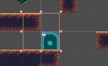
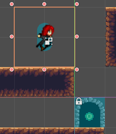
In Godot 3.0, when you create a scene or a node, a 64×64 selection square appears around it by default. You cannot change the size of this selection square, and resizing it changes the scale of the scene/node, rather than resizing it.

It gets particularly annoying when you are trying to place said scene/node instead of a snap-grid, and the 64×64 area not only clashes visually with your grid, it makes it hard to determine where the position actually is! It’s been a source of frustration for me as I learn how to make games using Godot.

The good news it that this seems to be one of the things getting changed for Godot 3.1. While looking to see if there are ways to work around this quirk of Godot, I came across this change being merged into Godot’s master branch: https://github.com/godotengine/godot/pull/17502

Basically, it resizes the selection rectangle to fit the dimensions of a sized child, and in cases where there is no sized child it uses a crosshair centered on the actual spawning position of the entity. This looks like it’ll resolve my gripes with the selection square quite well.
Godot 3.1 is currently in beta, so hopefully this will be released soon! Because the release seems imminent, I’ll just keep putting up with the selection square until 3.1 officially comes out.
No Comments