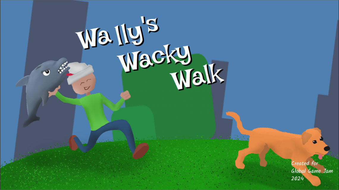
I recently presented a postmortem for the game I worked on for Global Game Jam 2024, Wally’s Wacky Walk. You can watch it here (along with other presentations from the IGDA Twin Cities community), and you can download the game here!
Posts Tagged with postmortem
Postmortem: Belle Bubb’s Sand-Witch Shop
Rebecca and I have spent the last half year working on the same game: Dice Tower (the full release). We hit a milestone of getting the game ready enough to show at a local playtest livestream, and I really wanted to take a break from Dice Tower development. The two of us decided to participate in another game jam; it would let us try making something different, and possibly something that would be worth continuing after Dice Tower was finished.
Participating in more game jams was something we’d intended to do after GMTK Game Jam last year, but we spent so much time focused on Dice Tower that we never made time for it.
After some research into game jams happening at the time, we chose to enter Godot Wild Jam 54. It’s a game jam where only Godot engine-made games were allowed, so we’d get a chance to see other games made in that engine. It was a smaller size game jam than others we’d entered in the past, so the odds that people would play our game (and leave feedback) was higher. Finally, the length of the jam was nine days, and we thought that would allow us to better fit jam work in alongside our normal day job and family responsibilities without taking too much time off.
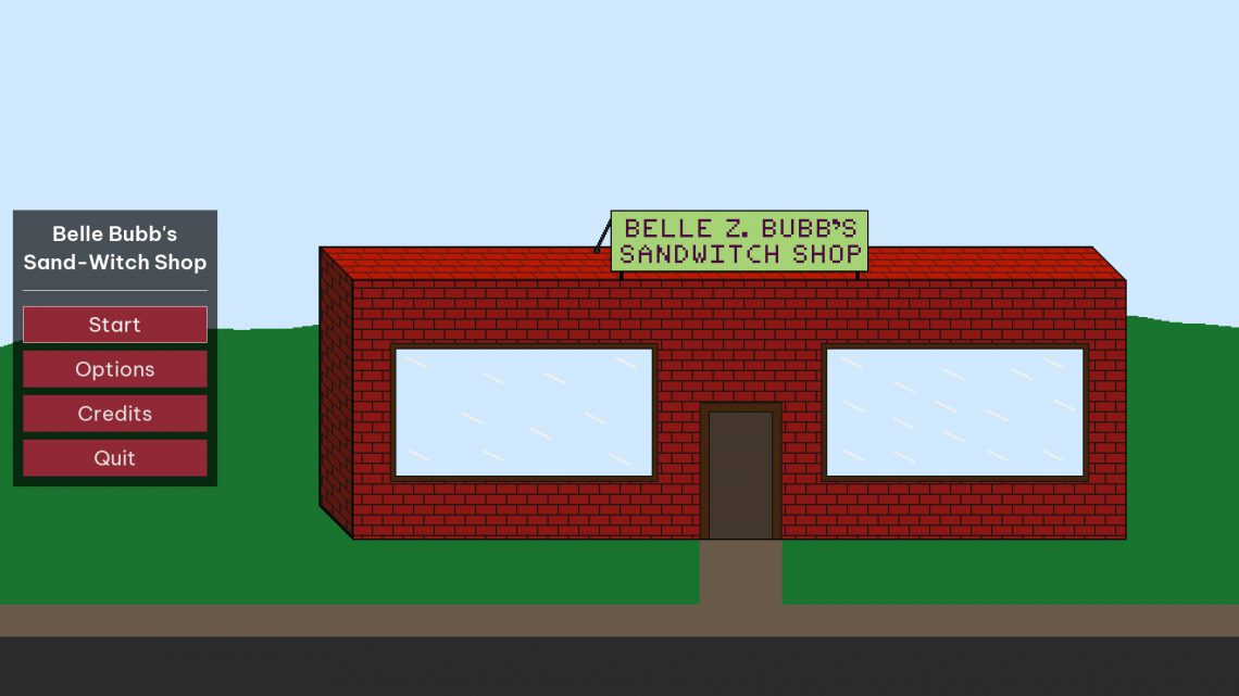
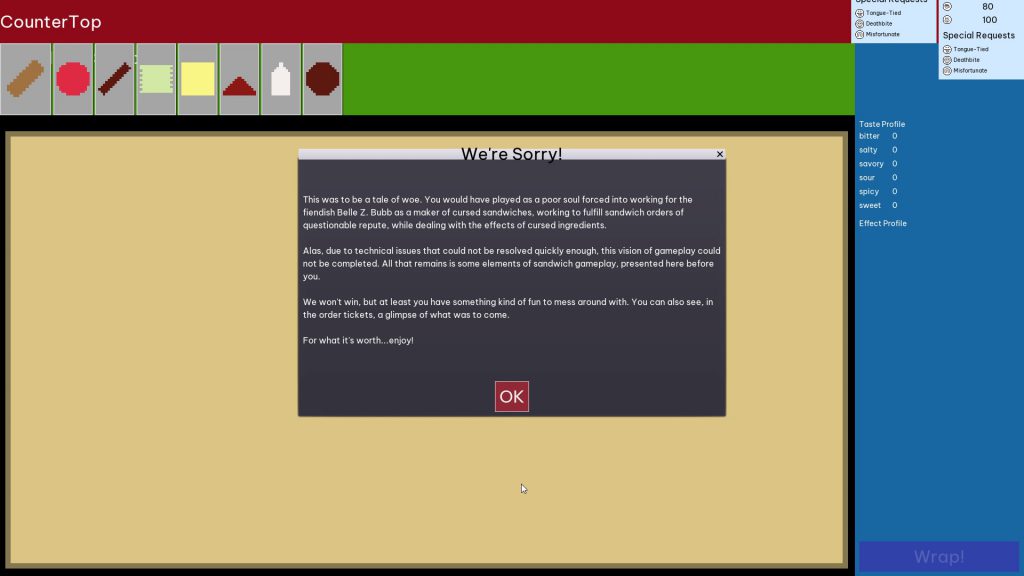
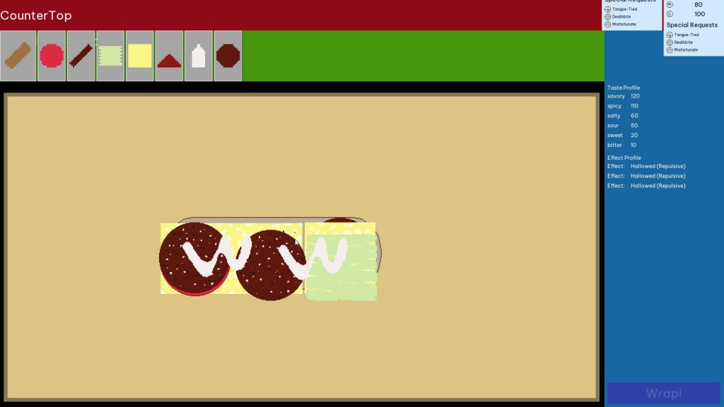
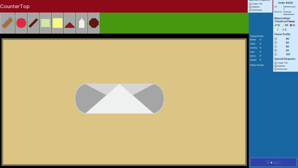
The game we created was Belle Bubb’s Sand-Witch Shop, and it was about working in a sandwich shop making “cursed sandwiches” (fitting the jam’s theme of “curses”) through 2D drag-and-drop gameplay. Sadly, we were unable to finish the game due to a convergence of multiple major issues; that said, those issues provided great insight into how to get better at making games, so I don’t think our efforts were wasted.
I’ll identify what those issues were, explain why they were problematic, and explain how I’m going to learn from them to become a better game developer.
Issue: Isolated Tests
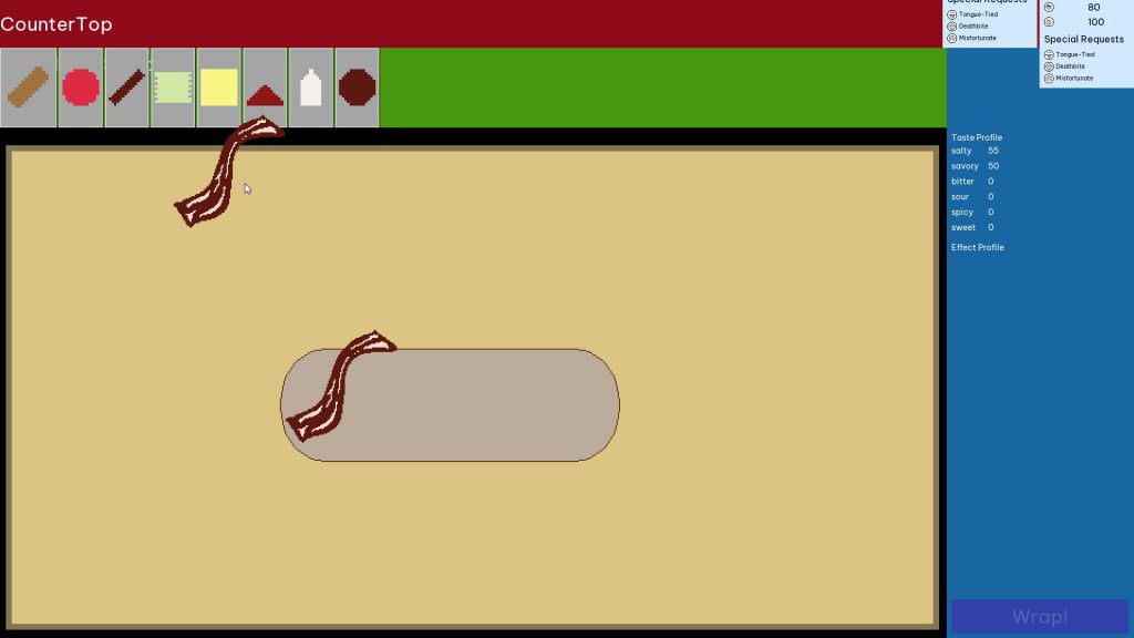
The gameplay for Belle Bubb’s Sand-Witch Shop involved doing new kinds of things that I was less familiar with, like drag and drop mechanics, evaluating what constituted a “sandwich”, and having ingredients that could interact with one another both during sandwich assembly and during sandwich consumption (aka “eating”). I chose to try and build each system in isolation and test that each worked well enough before moving on to others.
Creating all the systems in isolation meant there was no gameplay loop for the majority of the game’s development, so there couldn’t be any testing around whether the game was actually fun. Sure, dragging ingredients around and having them interact with one another was cool, but without evaluating them it was just an aimless sandbox experience. Testing the systems independently also meant I couldn’t see how well they’d interface with one another. This had catastrophic consequences when I encountered fatal issues with those systems once they were brought together.
Lesson Learned: No More Isolated Tests
I like making isolated tests because it’s simpler for me to wrap my head around them; I also don’t have to immediately worry about making them work as part of a whole. However, this is twice now that waiting to integrate systems until later in the project has resulted in slower progress. The jam version of Dice Tower was able to recover from this; Belle Bubb’s Sand-Witch Shop was not. Therefore, for games I’m working on the future, I need to build all the systems together at once. That should help me identify integration problems much sooner, and come up with better fixes for them.
Issue: Badly-Designed Resource System
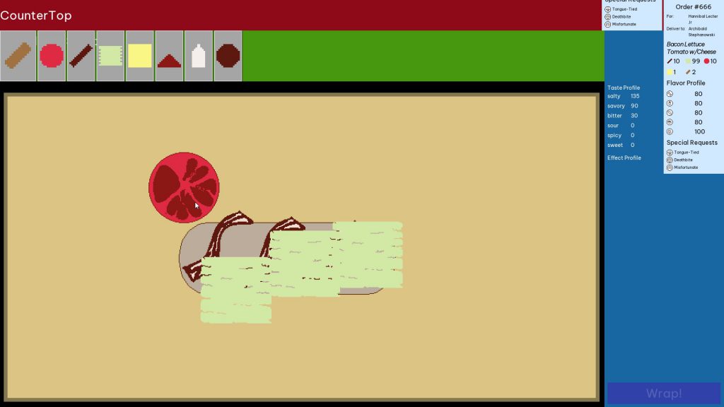
The foundation of evaluating the sandwich structure was a system that made heavy use of Godot’s customizable Resource nodes to store data in complex ways. This was somewhat similar to resource-based work that I’d created for Dice Tower, so I thought it wouldn’t be too much work to do the same kind of thing here. The architecture I came up with involved having the Ingredient resource store references to its UI model, and then the UI model also referencing its own Ingredient resource.
This dual-reference approach led to horrible issues with resource uniqueness. I was treating each Ingredient resource as a unique entity, but Godot treats resources as shared entities; anything holding a reference to a resource refers to the same instance of that resource. Since each ingredient, in design, could have its own unique set of curses and effects, I had to do a lot of duplication when creating new Ingredients and assigning them to models. This created all kinds of bugs where the stored data on a model or resource didn’t match what the game systems expected, and the massive amount of nesting took hours for me to debug.
All that stemmed from one complex resource system. I built multiple such architectures, and then had them all reference each other… The bugs stemming from that hell were the reason we wound up not being able to fully complete the game.
Lesson Learned: Don’t Abuse Resources
Working with Godot’s resources allows for creating powerful customizable systems, but it is incredibly easy to abuse that power to the point of making things insanely difficult to troubleshoot. I need to not use resources so much for the data solutions. At the very least, I need to minimize how much nested resource storage I’m doing, and make sure the architectures I’m coming up with aren’t fatally flawed before building on top of them.
Issue: Too Much Undetected Complexity
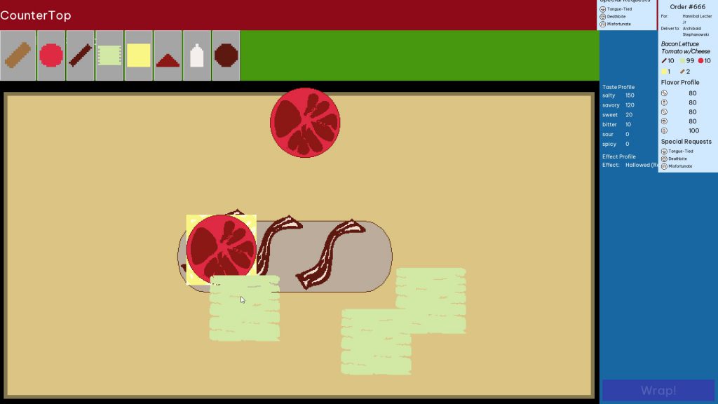
I had no idea how complex the game we were trying to make actually was. To illustrate, these are the features which we managed to get into the game. At the time of planning, I thought they were simple:
- Sandwiches have ingredients
- Ingredients have curses
- Curses have effects
- Ingredients can also have effects
- The same effects can be assigned to both curses and ingredients
- Ingredients have individual tastes
- Sandwich ingredients are combined together to form a recipe
- They also come together to form the actual sandwich
- Both of these have a “taste profile” that is the amalgamation of all ingredient tastes
- They also have an “effects profile” that is the amalgamation of all curse and ingredient effects
- Recipe and food need to be compared to each other to determine if they are “close enough”
- All of the above needs to be represented in-game and in UI
That wasn’t even the full scope of what we had originally planned to put into the game. Other ideas include:
- Randomizing which ingredients have what curses
- Getting paid for making sandwiches
- Using earned money to choose what ingredients to buy
- Having a story about how you sold your soul to keep your sandwich shop alive
- Post-sandwich order review that included descriptions of what effects your curses had
That was a lot of complexity. It didn’t feel that way at the beginning because I didn’t think things through. The further we got into making the game, the more I realized the amount of effort needed to make all these systems and interactions work was insane.
And, because I waited so long to bring systems together, I didn’t experience this revelation until it became too late to pivot to something simpler.
Lesson Learned: Work Through Systems Implications in Advance
I need to have much better insight ahead of time where potential complexities will arise. The best way I can think about doing that is diagramming them somewhere, on paper or in a whitescreen board app, so I can visualize what systems need to interact with one another. If there’s too much complexity, then it’s a clear sign that I need to scale things back. I’ve been worried in the past that this will make the process take longer, but the consequence of not trying to do so is having things take longer anyway and not realize it until it’s too late.
Issue: There Was No Planned Endgame
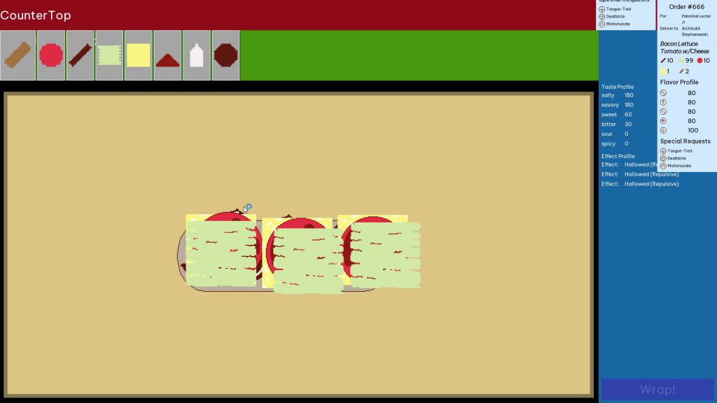
We came up with an idea for interesting gameplay, but had no concept of what the goal of the game was going to be. I kept putting a pin in it to “come back to” after the other systems were developed. Since none of the other systems were ever fully completed, we never got a chance to figure out what happens at the end.
Lacking this conceptualization of the player’s goal contributed to the underestimation of how much work was needed. There was no way to test the player could play through a core gameplay loop because we didn’t know what said loop was beyond “make a sandwich”. Without that guiding star, it was too easy to fall into a pattern of perfecting the systems with no plan for whether those systems would work well together to create a satisfying resolution.
Lesson Learned: Define the Goal at the Outset
Knowing what the player’s in-game goal is from the beginning not only gives a development target to shoot for in terms of minimum viability, but it also makes it clear what systems really need to be kept to make a fun gameplay experience. That doesn’t mean the goal has to be immutable; in fact, the goal will likely need to be simplified further as development roadblocks cut into available development time. If the goal is known in advance, though, then figuring out how to juggle all the necessary concerns should become much simpler.
Issue: I Was Overworked
As mentioned previously, we’d spent a long time before this working on Dice Tower. In that entire time, I hadn’t really taken a break, and this caught up with me during the jam.
I’m no stranger to pushing through burnout—I don’t think I’ve ever fully recovered from burning myself out nearly a decade ago—but I underestimated how much easier it is to work through burnout when on a consistent, slow grind. When I needed to work fast and come up with good ideas quickly, my brain refused to cooperate. That’s one of the reasons I didn’t have a good grasp on how complex the ideas were: I couldn’t think far enough ahead to evaluate the consequences of those ideas, so I instead ignored that part of the process to work on the next thing necessary. The consequence of working through major burnout was significantly slowed progress, much too slow for a game jam. Subsequently, since I fell behind pace, I didn’t give myself time to rest during the jam, which only further exacerbated the mental problems I was dealing with. It was a nasty negative feedback loop.
Lesson Learned: Take a Break!
I’m bad at taking time off to actually take time off. I also know that it’s easier for me to push through tiredness and make progress if I do it consistently. But there’s a limit to how much grind I can endure, and I need to respect that. At the very least, I should take some time off from game development and other project work prior to starting a new game jam, to give myself time to recharge properly. That should hopefully make it easier for me to work and plan properly, and thus also make it easier to not feel like I’m falling behind, resulting in pacing my work schedule appropriately.
Conclusion
I entered a game jam with the intent of working on a different project which might become future inspiration. Instead, I endured an experience that revealed multiple flaws with how I approach game development. Though the experience was painful, the lessons I learned from it are valuable, and that makes me glad for having gone through it.
Lest this postmortem post make it seem like the entire project was a disaster, let me highlight some of the things that did go right:
- People liked messing around with making the sandwiches, so there is an idea there which might be worth future exploration.
- While the resource system was buggy, it did allow for relatively easy creation of ingredients, curses, and effects.
- Of all the things that got cut, at least sound and music weren’t among them this time!
Our focus is going back to Dice Tower, but we definitely intend to enter game jams more frequently in the future. Even when the projects don’t succeed in being good games, they succeed in being great teachers.
Postmortem: Sanity Wars Reimagined
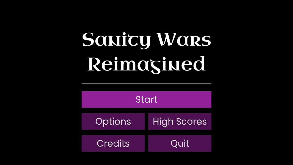
After seven months of development, Rebecca (PixelLunatic) and I have released Sanity Wars Reimagined! Along the way, we learned a lot, lessons we hope to apply to future games we develop. In this article, I want to dig a little bit into what we learned, from what we were initially trying to do to where we wound up, and the various lessons learned and mistakes made along the way.
You can check out Sanity Wars Reimagined on Itch.io!
This project started with a discussion Rebecca and I had about where things were from a long-term standpoint. For the past few years, we’d attempted, and abandoned, various prototypes, and it seemed like we were still far off from actually releasing a product. At the time, I had just come off of a month-long project exploring the creation of game AI; my intent was to start another project aimed at making improvements to the dialogue system. During our discussion, however, Rebecca pointed out that, while our ultimate goal was to make games and sell them, we had a bad habit of not committing to anything long enough to get it released. What’s more, she was concerned that this pattern of starting and abandoning projects wasn’t good for our morale.
She was right to be concerned about this; I’d felt that making an actual release was still a point far off in the distance, and this was making it easier for me to accept the idea of working on non-release projects, to “gain experience”. How would we ever learn how to improve, though, if we never got our projects to a releasable, playable state? Only two of our game jam games and one of our prototypes had ever been given to other people to play, so we had very little feedback on where we needed to improve. I realized that we couldn’t keep waiting to release something until “we got better”; we needed to make something and release it, however bad it may be.
We decided that we would start with a small project, so that it would take less time to get it to a releasable state. To that end, we determined that the project should be a remake of our first jam game, Sanity Wars. By remaking a game that was already released, we thought, we could focus on actually building the parts needed to make the game work; since I’d made those things work previously, we would hopefully avoid the pitfall of trying to create mechanics that were beyond our current skill to implement, or would take too much time to build. Why Sanity Wars? Out of all the previous jam games we’d made, it seemed like the most successful one, so we thought we could just add some polish, redo the art (since Rebecca did not do the original’s art), and it would be fine.
With that, our next project was set: Sanity Wars Reimagined. We would stay faithful to the mechanics of the original, aiming only to remake them in Godot, as this would be quicker than trying to iterate and make new mechanics. I would also take the opportunity to try and make systems that would be reusable in future games; ideally, we would treat Sanity Wars Reimagined as a foundation that we would directly expand upon for the next game. Since the original Sanity Wars was done in three full days, I thought this project wouldn’t take long to complete. Accounting for our busy adult schedules, I estimated the work would take two weeks to complete; at most, a month.
It didn’t take two weeks. It didn’t take a month. It took seven months before we finally released Sanity Wars Reimagined on Itch.io. Along the way, we made significant modifications to the core mechanics, removing multiple parts that were considered essential to the original Sanity Wars; even with those changes, the end result was still not that fun (in our minds). There were many times during the development period where it felt like it was going to drag on and on, with no end in sight. All that said, I still think Sanity Wars Reimagined was a successful release.
Why do I think that? To answer that question, I want to examine what technologies we developed during the project, what mistakes we made, and what we plan to do to improve things for our next project.
Technologies Developed
A lot of what I made from a code standpoint was able to be imported back into my boilerplate Godot project, which will then be available from the start when I clone the Genesis boilerplate to make any future game project. In doing so, I’ve hopefully decreased the amount of development time needed for those projects.
Genesis is name of a tool I created in NodeJS that lets me keep a centralized Godot boilerplate template and create new projects from that boilerplate using simple commands in a command line interface. To give a non-technical summary, it allows me to quickly create and update new Godot projects that include common code that I want to reuse from project to project.
Here are some of the things that I’ll be able to make use of as a result of the work done for Sanity Wars Reimagined:
Resolution Management
There is a lot to consider when supporting multiple resolutions for a game, especially one that uses a pixel art aesthetic. I was already aware of this before committing to figuring out a solution for Sanity Wars Reimagined, but I underestimated just how much more there was to learn. The good news is that I created a solution that not only works for Sanity Wars Reimagined, but is generalized enough that I can use it as the starting point for future games.
I’ll talk in brief about some of the struggles I had to contend with and what I did to solve them.
For starters, when working with pixel art, scaling is a non-trivial issue. Because you are literally placing pixels in precise positions to render your art aesthetic, your scaling must always keep the same aspect ratio as your initial render; on top of that, it must specifically be increased in whole integer factors. This means you can only support a limited number of window sizes without messing up the pixel art. That plays a huge factor in determining what your base size is going to be; since most monitors use a 1920px by 1080px resolution size, your base needs to be a whole integer scale of 1920×1080, or else the game view is not going to actually fill the whole screen when it is maximized to fill the screen (aka fullscreen).
The way fullscreen modes are typically handled for pixel art games, when they attempt to handle it at all, is to set the game view to one of those specific ratios, and letterbox the surrounding area that doesn’t fit cleanly into that ratio. That is the approach I chose for my fullscreen management as well.
Godot does give you the means to scale your game window such that it renders the pixel art cleanly, and you can also write logic to limit supported resolution sizes to only those that scale in whole integers from the base resolution. However, there is a catch with the native way Godot handles this: any UI text that isn’t pixel-perfect becomes blurry, which isn’t a great look to have. I could have switched to only using pixel-perfect fonts, but that wasn’t the look I wanted the game UI to have. After spending a lot of time experimenting with ways to handle this in Godot’s settings, I determined that I would have to create a custom solution to achieve the effect that I wanted.
I wound up talking to Noel Berry (of Extremely OK Games) about how Celeste handled this problem, as its crisp UI over gameplay pixel art was similar to what I was hoping to achieve. He told me that they actually made the UI render at 1920×1080 at default, and then scaled the UI up or down depending on what the game’s current resolution was. This inspired me to create a version of that solution for Sanity Wars Reimagined. I created a UI scaling node that accepts a base resolution, and then changes its scale (and subsequently the scale of its child and grandchild nodes) in response to what the game’s current resolution is. It took a lot of effort, but in the end I was able to get this working correctly, with some minor caveats*.
* I’ll be coming back to these caveats later on in the article, when I discuss mistakes that were made.
Overall, I’m very pleased with the solution I developed for resolution management in Sanity Wars Reimagined, and ideally this is something that should just work for future pixel art-based games.
Screen Management
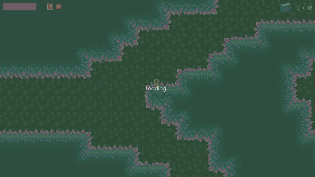
Another system I developed for Sanity Wars Reimagined is a screen management system that supports using shaders for screen transitions. Although my boilerplate code already included a basic screen manager that was responsible for changing what screens were being currently portrayed (MainMenuScreen, GameScreen, etc.), a significant flaw it had was that it didn’t provide support for doing screen transitions. This was going to be a problem for Sanity Wars Reimagined, as the original game had fade transitions between the different screen elements. I thus set out to refactor my screen management to support doing transitions.
In the original Sanity Wars, the way I accomplished the fade was through manipulating the drawn image in the browser’s canvas element (as the original game was built using HTML/JavaScript, the technologies I was most familiar with at the time). It was hardcoded to the custom engine I’d built, however, and there wasn’t a direct way to achieve the same effect in Godot. It’s possible I could have made the fade transition, specifically, work by manipulating the screen node’s modulation (visibility), but I didn’t feel comfortable making direct changes to node properties for the sake of screen effects, especially if I wanted to have the ability to do other kinds of transitions in the future, such as screen slides or flips; anything more complex than that would be outright impossible through mere node property manipulation.
My focus turned towards experimenting with a different approach, one based on using Godot’s Viewport node to get the actual render textures, and then manipulating the raw pixels by applying shaders to the render images of the outgoing screen and the incoming screen. Viewports were something I hadn’t had much experience with, however, so I wasn’t certain if the idea I had would actually work. To prove the concept, I spent a weekend creating a prototype specifically to test manipulating viewport and their render textures. The approach did, in fact, work as I envisioned (after a lot of research, trial, and error), so I proceeded to refactor the screen management system in Sanity Wars Reimagined to use this new approach.
When referring to screens here, I’m not talking about physical monitor screens; it’s a term I use to refer to a whole collection of elements comprising a section of the game experience. For instance, the Main Menu Screen is what you see on booting up the game, and Game Screen is where the gameplay takes place.
Overall, the refactor was an immense success. The fade effect worked precisely the way it did for the original Sanity Wars, and the system is flexible enough that I feel it should be easy enough to design new screen transition effects (in fact, I did create one as part of making the LoadingScreen, transitioning to an in-between screen that handled providing feedback to the user while the incoming GameScreen prepared the gameplay). Should I want to create different visual effects for future transitions, it should be as simple as writing a shader to handle it. (Not that shaders are simple, but it is far easier to do complex visual effects with shaders than with node property manipulation!)
Automated Export Script
After realizing that I needed to export game builds frequently (more on that later), I quickly found that it was tedious to have to work through Godot’s export interface every time I wanted to make a build. On top of that, Godot doesn’t have native build versioning (at least, not that I’ve found), so I have to manually name each exported build, and keep track of what the version number is. Needless to say, I wondered if there was a way I could automate this process, possibly through augmenting the Genesis scripting tools to include a simple command to export a project.
I took a few days to work through this, and in the end I managed to create functionality in my Genesis scripting tool that did what I wanted. With a simple command, godot-genesis export-project "Sanity Wars Reimagined" "Name Of Export Template", Genesis would handle grabbing a Godot executable and running a shell command to make Godot export the project using the provided export template, and then create a ZIP archive of the resulting export. The name of the export was the project name, followed by a build number using the semantics I chose (major.minor.patch.build). By providing a -b flag, I could also specify what kind of build this was (and thus which build number to increment). It works really well, and now that exports are so easy to do I am more willing to make them frequently, which allows me to quickly make sure my development changes work in the release builds.
Other Features and Improvements
There are many other features that were created for Sanity Wars Reimagined; to save time, I’ll simply give brief summaries of these. Some of these were not generalized enough to be ported back into the Genesis boilerplate, but the experience gained from creating them remains valuable nonetheless.
Generators
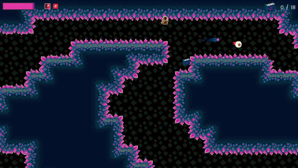
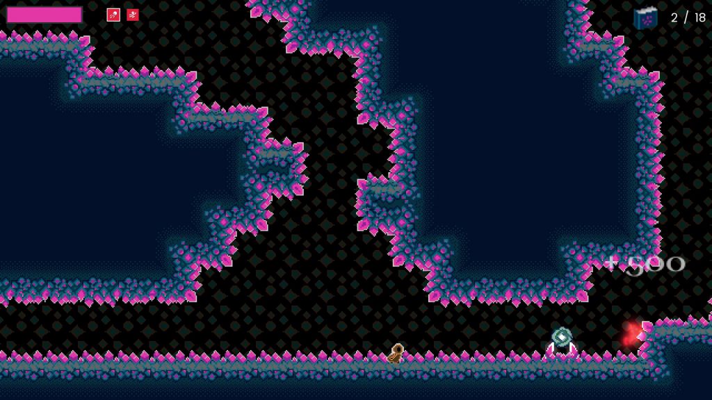
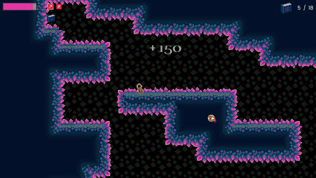
These nodes handle spawning entities, and I made the system flexible enough that I can pretty much generate any kind of object I want (though, in this case, I only used it to spawn Eyeballs and Tomes).
RectZone
This is a node which let me specify a rectangular area that other nodes (like Generators) could use to make spatial calculations against (aka figure out where to spawn things).
PixelPerfectCamera
This is a Camera node that was customized to support smoothing behavior rounded to pixel-perfect values. This helps reduce the amount of visual jitter that results from when a camera is positioned between whole integer values.
The reason this happens is because pixels can’t be rendered at fractional, non-integer values, so when a pixel art game asset is placed such that the underlying pixels don’t line up to a whole integer, the game engine’s renderer “guesses” what the actual pixel color values should be. This is barely noticeable for high-resolution assets because they consist of a huge number of pixels, but for something as low-resolution as pixel art, this results in visual artifacts that look terrible.
UI Theming
I finally took a dive into trying to understand how Godot’s theme system works, and as a result I was able to create themes for my UI that made it much simpler to create new UI elements that already worked with the visual design of the interface. I plan to build on my experience with UI themes for future projects, and ultimately want to make a base theme for the Genesis boilerplate, so I don’t have to create new themes from scratch.
State Machine Movement
I converted my previous Player character movement code to be based on a state machine instead of part of the node’s script, and this resulted in movement logic that was far simpler to control and modify.
As you can see, there were a lot of features I developed for Sanity Wars Reimagined, independent of gameplay aspects. A large part of what I created was generalized and reusable, so I can put the code in future projects without having to make modifications to remove Sanity Wars-specific functionality.
Complications
No human endeavor is perfect, and that is certainly true for Sanity Wars Reimagined. In fact, I made a lot of mistakes on this project. Fortunately, all of these mistakes are things I can learn from to make future projects better. I’ll highlight some of these issues and mistakes now.
Both Rebecca and I learned a lot from the mistakes we made developing this project, but I’m specifically focusing on my mistakes in this article.
New Systems Introduced New Complexities
The big systems I added, like Resolution Management and Screen Management, added lots of functionality to the game. With that, however, came gameplay issues that arose as the result of the requirements integrating with these systems introduced.
Take ScreenManager, for example. The system included the ability to have screens running visual updates during the transition, so the screen’s render texture didn’t look like it was frozen while fading from one screen to the next. By creating this capability, however, I needed to modify the existing game logic to take into account the idea that it could be running as part of a screen transition; for instance, the player character needed to be visible on the screen during the transition, but with input disabled so the player couldn’t move while the transition was running.
Another issue the ScreenManager refactor created had to do with resetting the game when the player chose to restart. Before, screens were loaded from file when being switched to, and being unloaded when switched from, so restart logic was as simple as using node _ready() methods to set up the game logic. After the refactor, this was no longer true; to avoid the loading penalty (and subsequent screen freeze) of dealing with loading scenes from file, ScreenManager instead kept inactive screens around in memory, adding them to the scene tree when being transitioned to and removing them from the scene tree when being transitioned from. Since _ready() only runs once, the first time a node enters the scene tree, it was no longer usable as a way to reset game logic. I had to fix this by explicitly creating reset functions that could be called in response to a reset signal emitted by the controlling screen, and throughout the remaining development I encountered bugs stemming from this change in game reset logic.
ResolutionManager, while allowing for crisp-looking UI, created its own problems as well. While the UI could be scaled down as much as I wanted, at smaller resolutions elements would render slightly differently from how they looked at 1920×1080. The reason for this was, ironically, similar to the issues with scaling pixel art: by scaling the UI down, any UI element whose size dimensions did not result in whole-number integers would force Godot’s renderer to have to guess what to render for a particular pixel location on the monitor. Subsequently, some of the UI looked bad at smaller resolutions (such as the outlines around the spell selection indicators). I suspect I could have addressed this issue by tweaking the UI design sizes to scale cleanly, but my attempts to change those values resulted in breaking the UI in ways I couldn’t figure out how to fix (largely due to my continued troubles understanding how to create good UI in Godot). In the end, I decided that, with my limited amount of time, trying to fix all the UI issues was less important than fixing the other issues I was working on, and ultimately the task was cut during the finishing stages of development.
I’m guessing most people won’t notice, anyway, since most people likely have the game at fullscreen, anyway.
Complexities arising from implementing new systems happened in other ways throughout the project as well, although the ones stemming from ScreenManager and ResolutionManager caused some of the bigger headaches. Fixing said issues contributed to extending development time.
Designing for Randomization
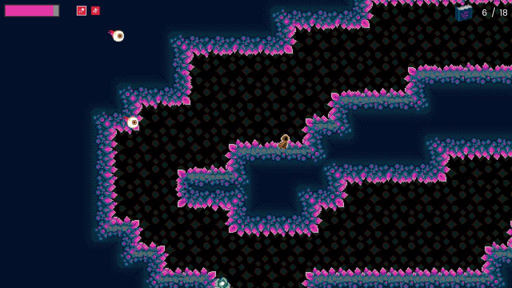
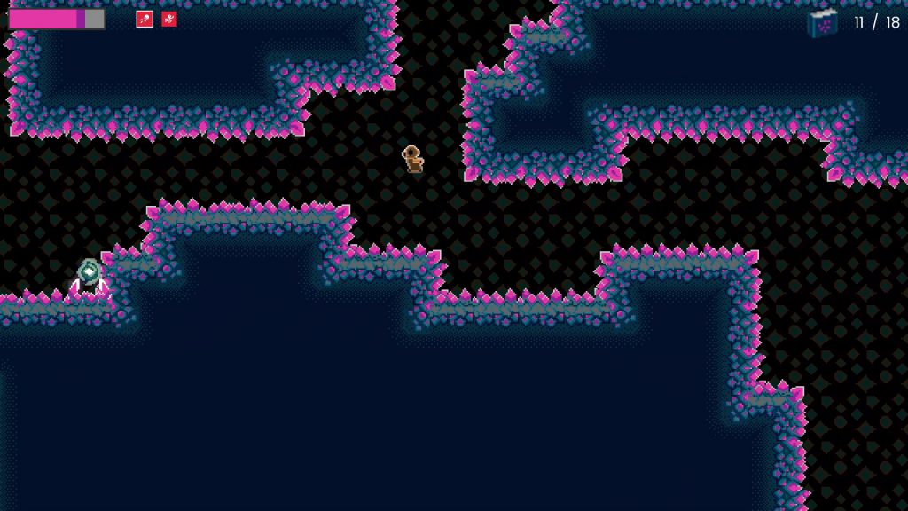
One of the core mechanics of Sanity Wars (original and Reimagined) is that all the entities in the game spawn at random locations on an unchanging set of maps. At the time I created the mechanic, my thought was that this was a way to achieve some amount of replayability, by having each run create different placements for the tomes, eyeballs, portals, and player.
Playtesters, however, pointed out that the fully random nature of where things spawned resulted in wide swings of gameplay experience. Sometimes, you got spawns that made runs trivially easy to complete; other times, the spawns made runs much more difficult. This had a negative impact on gameplay experience.
The way to solve this is through creating the means of controlling just how random the processes are. For example, I could add specific locations where portals were allowed to spawn, or add logic to ensure tomes didn’t spawn too close to portals. Adding controlled randomness isn’t easy, however, because by definition it means having to add special conditions to the spawning logic beyond simply picking a location within the map.
The biggest impact of controlled randomness wasn’t directly felt with Sanity Wars Reimagined, however; it was felt in our plans to expand directly off of this project for our next game. Given that random generation was a core element of gameplay, that meant adding additional elements would also need to employ controlled randomness, and that would likely result in a lot of work. On top of that, designing maps with randomness in mind is hard. It would likely take months just to prototype ideas, let alone flesh them out into complete mechanics.
This aspect, more than anything else, was a huge influence in our decision to not expand on Sanity Wars Reimagined for the next project, but to concentrate on a more linear experience. (More on that later.)
Clean Code
If you’re a programmer, you might be surprised at seeing “clean code” as a heading under complications. If you’re not a programmer, let me explain, very roughly, what clean code is: a mindset for writing code in such a way that it is easy to understand, has specific responsibilities, and avoids creating the same lines of code in different files; through these principles one’s code should be easier to comprehend and use throughout your codebase.
Under most circumstances, writing clean code is essential for making code not only easier to work with, but faster to develop. So how did writing clean code make Sanity Wars Reimagined more complex?
Simply put, the issue wasn’t strictly with adhering to clean code principles in and of themselves; the issue was when I spent a lot of time and effort coming up with clean code for flawed systems. Clean code doesn’t mean the things you create with it are perfect. In fact, in Sanity Wars Reimagined, some of the things I created wound up being harmful to the resulting gameplay.
A prime example of how this impacted development is the way I implemented movement for the Eyeball entity. I had the thought of creating a steering behavior-based movement system; rather than giving the entity a point to navigate to and allowing it to move straight there, I wanted to have the entity behave more like real things might move (to put it in very simple terms). I then spent a long time creating a locomotion system that used steering behaviors, trying to make it as clean as possible.
In the end, my efforts to integrate steering behavior movement were successful. There was a huge flaw, however; the movement hampered gameplay. Steering behaviors, by design, are intended to give less-predictable behavior to the human eye, which makes it harder to predict how the eyeball is going to move when it isn’t going in a straight line. This style of movement also meant the Eyeballs could easily get in a position where it was difficult for the player to hit them with the straight-line spirit bullet projectile, which was specifically intended for destroying Eyeballs. Since steering behaviors work by applying forces, rather than explicitly providing movement direction, there wasn’t an easy, feasible way for me to tweak the movement to make it easier for the player to engage with Eyeballs.
In addition to making Eyeballs less fun to play against, the steering behaviors also made it hard to make Eyeballs move in very specific ways. When I was trying to create a dive attack for the Eyeball, I literally had to hack in movement behavior that circumvented the steering behaviors to try and get the attack to visually look the way I wanted to; even then, I still had a lot of trouble getting the movement to look how I felt it should.
How did clean code contribute to this, precisely? Well, I’d spent a lot of time creating the locomotor system and making it as clean an implementation as I possibly could, before throwing it into the gameplay arena to be tested out and refined. If there had been time to do so, I likely would have needed to go back and refactor the Eyeball movement to not use steering behaviors; all that work I’d spent making the steering behavior implementation nice and clean would’ve gone to waste.
Don’t get me wrong; writing clean code is very important, and there is definitely a place for it in game development. The time for that, however, is not while figuring out if the gameplay works; there’s no sense in making something clean if you’re going to end up throwing it out shortly thereafter.
Playtesting
I didn’t let other people playtest the game until way too late in development. Not only did that result in not detecting crashes in release builds, it also meant I ran out of time to properly take feedback from the playtests and incorporate it back into the game.
For the first three months of development, I never created a single release build of Sanity Wars Reimagined. I kept plugging away in development builds. The first time I attempted exporting the project was the day, no, the evening I was scheduled to bring the game to a live-streamed playtest session with IGDA Twin Cities. As a result, it wasn’t until two hours before showtime that I found out that my release builds crashed on load. I spent a frantic hour hack-fixing the things causing the crashes, but even with that, the release build still had a major, game-breaking bug in it: the testers couldn’t complete the game because no portals spawned. Without being able to complete the game, the testers couldn’t give me good feedback on how the game felt to them. From that point onward, I made a point of testing exports regularly so that something like that wouldn’t catch me off-guard again.
The next time I brought the game out for playtesting was in the middle of January 2022, three months after the first playtest. At that point, I’d resigned myself to the fact that Sanity Wars Reimagined didn’t feel fun, and was likely going to be released that way; my intent with attending the playtest was to have people play the game and help me make sure I didn’t have any showstopping bugs I’d need to fix before release. What I wasn’t expecting (and, in retrospect, that was silly of me) was that people had a lot to say about the game design and ways it could be made more fun.
To be honest, I think I’d been stuck so long on the idea that I wanted to faithfully recreate the original game’s mechanics that I didn’t even think about making changes to them. After hearing the feedback, however, I decided that it would be more important to make the game as fun as I could before release, rather than sticking to the original mechanics.
That playtest, however, was one and a half weeks before the planned release date, meaning that I had very little time to attempt making changes of any significance. I did what I could, however. Some of the things I changed included:
- Removing the sacrifice aspect of using spells. Players could now access spells right away, without having to sacrifice their maximum sanity.
- Giving both the spells dedicated hotkeys, to make them easier (and thus more likely) to be used.
- Adding a countdown timer, in the form of reducing the player’s maximum sanity every so often, until the amount was reduced to zero, killing the player. This gave players a sense of urgency that they needed to resolve, which was more interesting than simply exploring the maps with no time constraints.
- Changing the Eyeball’s attack to something that clearly telegraphed it was attacking the player, which also made them more fun to interact with.
- Adding a scoring system, to give the player something more interesting to do than simply collecting tomes and finding the exit portal.
- Various small elements to add juice to the game and make it feel more fun.
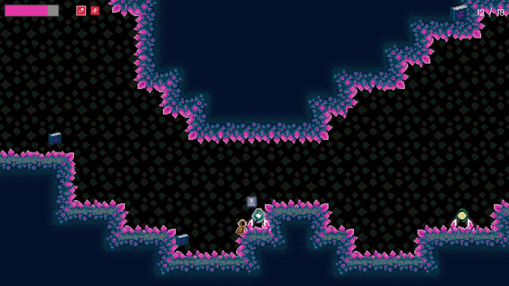
Although we did wind up extending the release date by a week (because of dealing with being sick on the intended release week), I was surprised with just how much positive change I was able to introduce in essentially two and a half weeks’ worth of time. I had to sacrifice a lot of clean code principles to do it (feeding into my observation about how doing clean code too early was a problem), but the end result was an experience that was far more fun than it was prior to that play test.
I can only imagine how much more fun the game could’ve been if I’d had people involved with playtesting in the early stages of development, when it would’ve been easier to change core mechanics in response to suggestions.
Thanks to the IGDA Twin Cities playtest group, and specifically Mark LaCroix, Dale LaCroix, and Lane Davis, for offering many of the suggested changes that made it into the final game. Thanks also to Mark, Lane, Patrick Grout, and Peter Shimeall for offering their time to playtest these changes prior to the game’s release.
Lack of a Schedule
I mentioned previously that I’d thought the entire Sanity Wars Reimagined project wouldn’t take more than a month, but I hadn’t actually established a firm deadline for when the project needed to be done. I tried to implement an approach where we’d work on the project “until it felt ready”. I knew deadlines were a way that crunch could be introduced, and I wanted to avoid putting ourselves in a situation where we felt we needed to crunch to make a deadline.
The downside, however, was that there wasn’t any target to shoot for. Frequently, while working on mind-numbing, boring sections of code, I had the dread fear that we could wind up spending many more months on this project before it would be finished. This fear grew significantly the longer I spent working on the project, my initial month-long estimate flying by the wayside like mile markers on a highway.
Finally, out of exasperation, I made the decision to set a release date. Originally, the target was the middle of December 2021, but the game wasn’t anywhere near bug-free enough by that point, so we pivoted to the end of January 2022, instead. As that deadline approached, there were still dozens upon dozens of tasks that had yet to be started. Instead of pushing the deadline out again, however, I went through the list to determine what was truly essential for the game’s release, cancelling every task that failed to meet that criteria.
Things that hit the cutting room floor include:
- Adding a second enemy to the game, which would’ve been some form of ground unit.
- Refactoring the player’s jump to feel better.
- Fixing a bug that caused the jump sound to sometimes not play when it should.
- Adding keyboard navigation to menus (meaning you had to use the mouse to click on buttons and such).
- Create maps specifically for the release (the ones in the final build are the same as the ones made for the second playtest).
It’s not that these things wouldn’t have improved the game experience; it’s just that they weren’t essential to the game experience, or at least not enough to make it worth extending the release date to incorporate them. By this point, my goal was to finish the game and move on to the next project, where, hopefully, I could do a better job and learn from my mistakes.
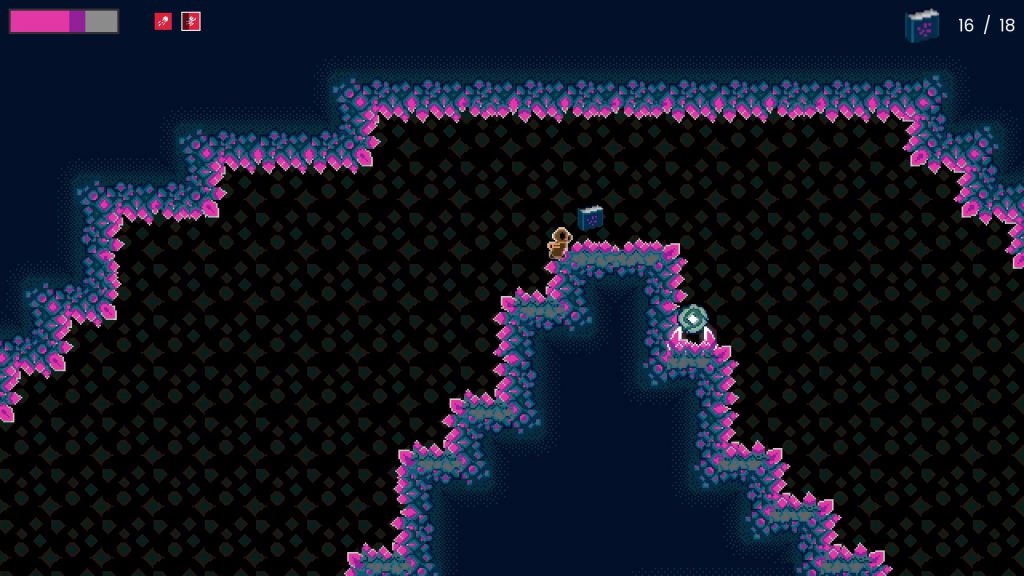
These are far from the only complexities that we had to deal with during Sanity Wars Reimagined, but they should serve to prove that a lot of issues were encountered, and a lot of mistakes were made. All of these things, however, are learning opportunities, and we’re excited to improve on the next project.
Improvements for Next Time
There’s a lot of things that I want to try for the next project; many of them serve as attempts to address issues that arose during the development of Sanity Wars Reimagined.
Have A Planned Release Date
I don’t want to feel like there’s no end in sight to the next project, so I fully intend to set a release date target. Will we hit that target? Probably not; I’m not a great estimator, and life tends to throw plenty of curveballs that wreak havoc on plans. By setting an end goal, however, I expect that it will force us to more carefully plan what features we want to try and make for the next game.
In tandem with that, I want to try and establish something closer to a traditional game development pipeline (or, at least, what I understand of one), with multiple clearly-defined phases: prototyping, MVP, alpha, beta, and release. This will hopefully result in lots of experimentation up front that settles into a set of core mechanics, upon which we build lots of content that is rigorously tested prior to release.
Prototype Quickly Instead of Cleanly
Admittedly, the idea of not focusing on making my code clean rankles me a bit, as a developer, but it’s clear that development moves faster when I spend less time being picky about how my code is written. Plus, if I’m going to write something, find out it doesn’t work, and throw it away, I want to figure that out as quickly as possible so I can move on to trying the next idea.
Thus, during the prototyping phase of the next project, I’ll try to not put an emphasis on making the code clean. I won’t try to write messy code, of course, but I’m not going to spend hours figuring out the most ideal way to structure something. That can wait until the core mechanics have been settled on, having been playtested to confirm that said mechanics are fun.
Playtest Sooner Rather Than Later
The feedback I received from the final big playtesting session of Sanity Wars Reimagined was crucial in determining how to make the game more fun before release. For the next project, I don’t want to wait that long to find out what’s working, what’s not, and what I could add to make things even more fun.
I don’t think I’ll take it to public playtesting right away, but I’ll for sure reach out to friends and interested parties and ask them to try out prototype and MVP builds. It should hopefully be much easier to make suggested changes during those early stages, versus the week before release. With more frequent feedback, I can also iterate on things more often, and get the mechanics to be fun before locking them down and creating content for them.
Make a Linear Experience
After realizing how much work it would be to try and craft a good random experience, I’ve decided that I’m going to purposely make the next game a linear experience. In other words, each playthrough of the game won’t have randomness factoring into the gameplay experience. This may be a little more “boring”, but I think doing it this way will make it easier for me to not only practice making good game design, but make good code and good content for as well.
Will it be significantly less fun than something that introduces random elements to the design? Maybe, maybe not. We’ll find out after I attempt it!
Those are just a few of the things I intend to try on the next project. I don’t know if all of the ideas will prove useful in the long run, but they at least make sense to me in the moment. That’s good enough, for now. Whatever we get wrong, we can always iterate on!
Conclusion
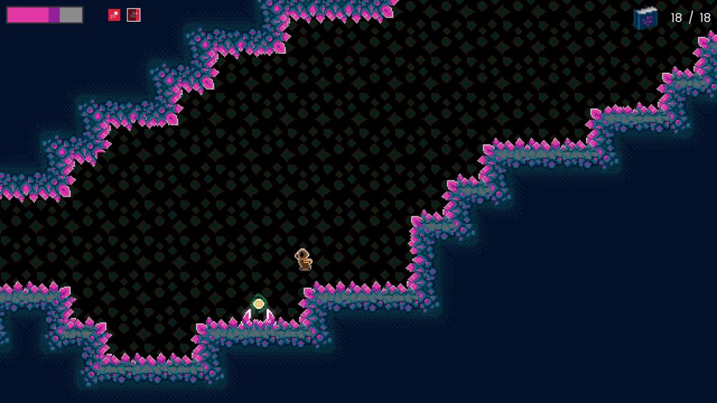
That’s the story of Sanity Wars Reimagined. We started the project as an attempt to make a quick release to gain experience creating games, and despite taking significantly longer than planned, and the numerous mistakes made along the way, we still wound up releasing the game. Along the way, we developed numerous technologies, and learned lots of lessons, that should prove immensely useful for our next project. Because of that, despite the resulting game not being as fun as I wish it could’ve been, I consider Sanity Wars Reimagined a success.
What’s next for Rebecca and I? It’ll for sure be another platformer, as that will allow us to make good use of the technologies and processes we’ve already developed for making such games. I fully expect there will be new challenges and complications to tackle over the course of this next project, and I can’t wait to create solutions for them, and learn from whatever mistakes we make!
